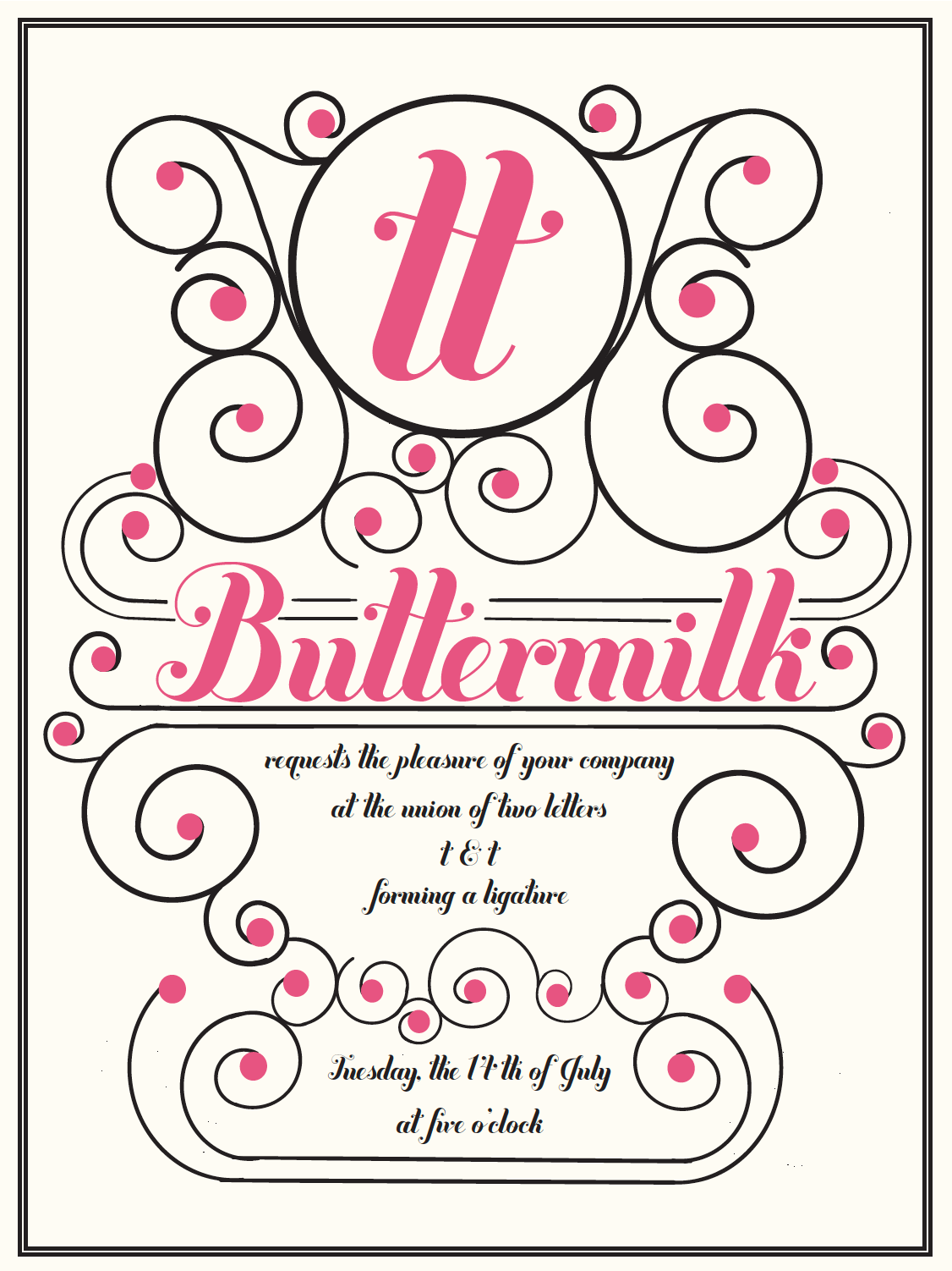
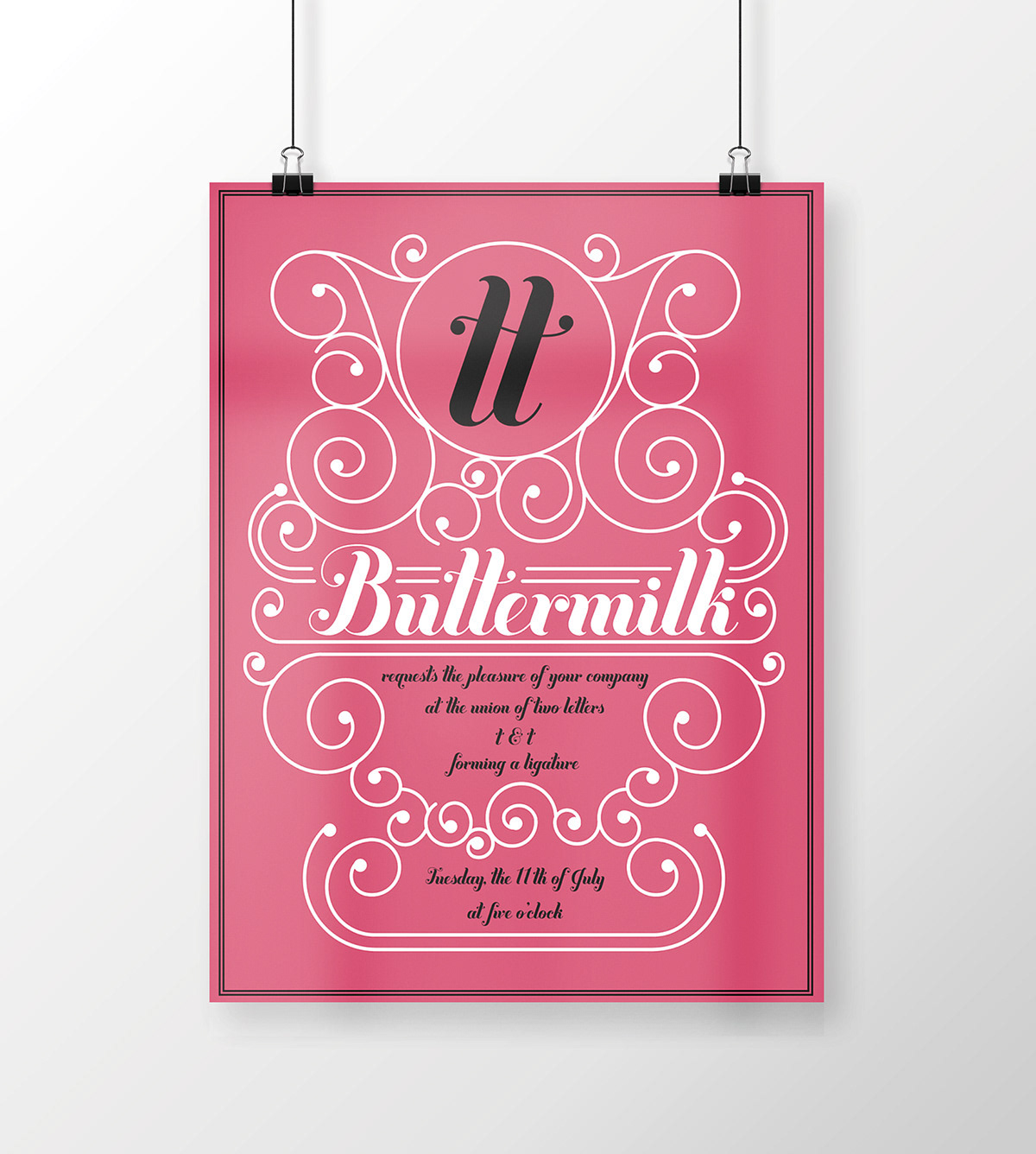
For this assignment in my typography course, I had to choose a designer's typeface and create a two-sided poster depicting an important facet of the typeface.
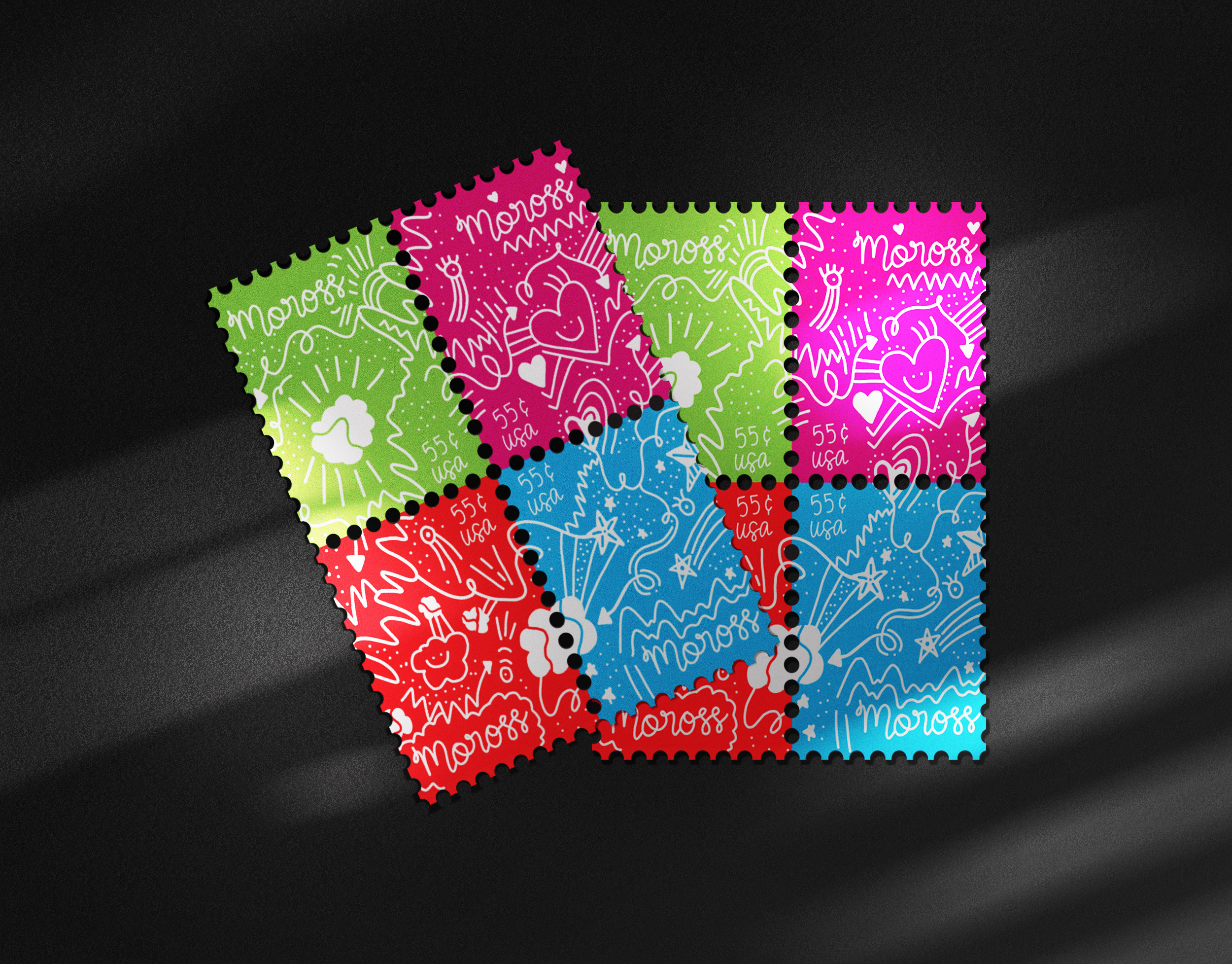
I chose Buttermilk, a typeface that was created by Jessica Hische and is most commonly used on wedding invitations because of its calligraphic nature, which is what I decided to encapsulate on my poster.
The swirly illustrations were hand-drawn in Adobe Draw on an iPad by me.

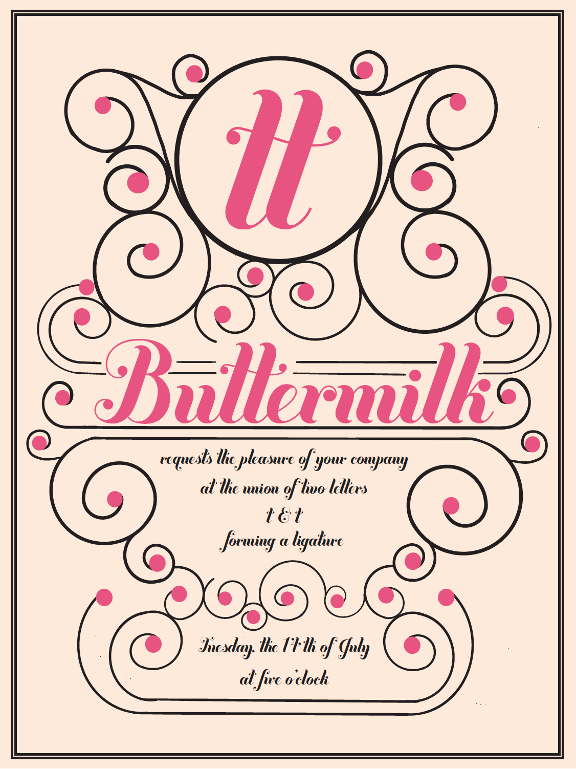
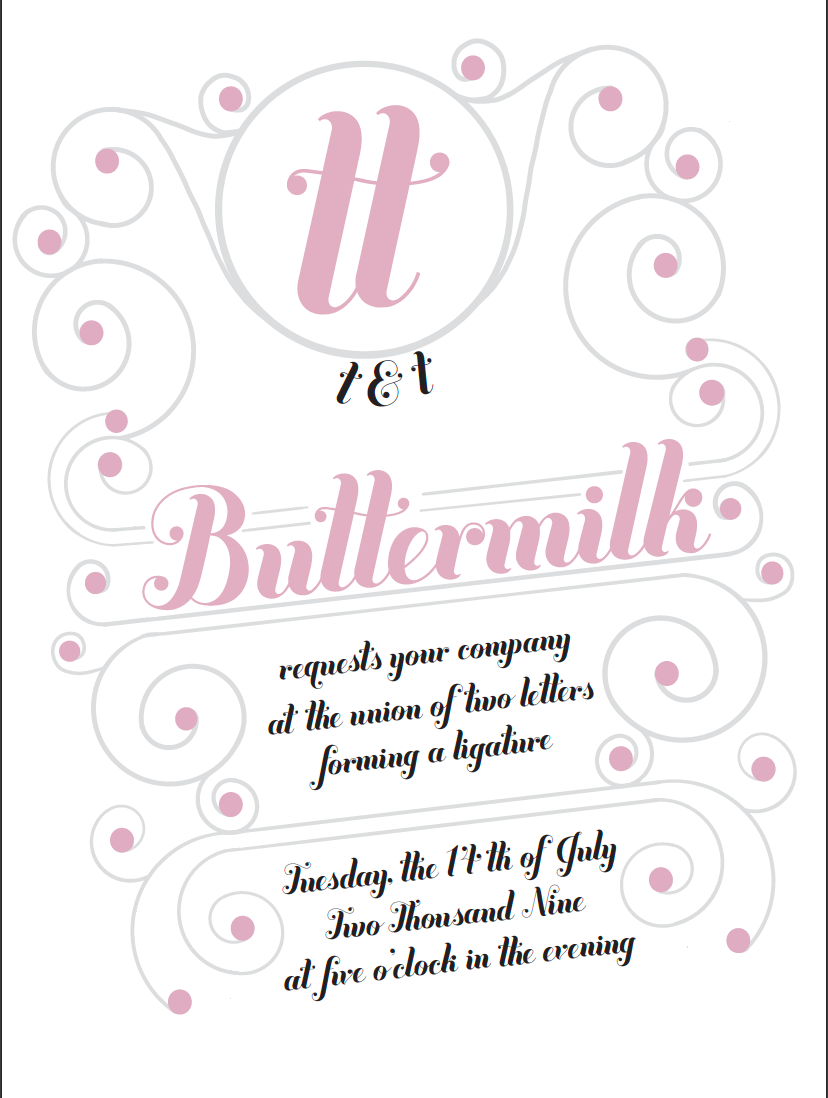
One of the most important processes of design is trying to decide on the right color scheme. Below, you can see a bit of my process as I came to find the color scheme used in my final poster design.